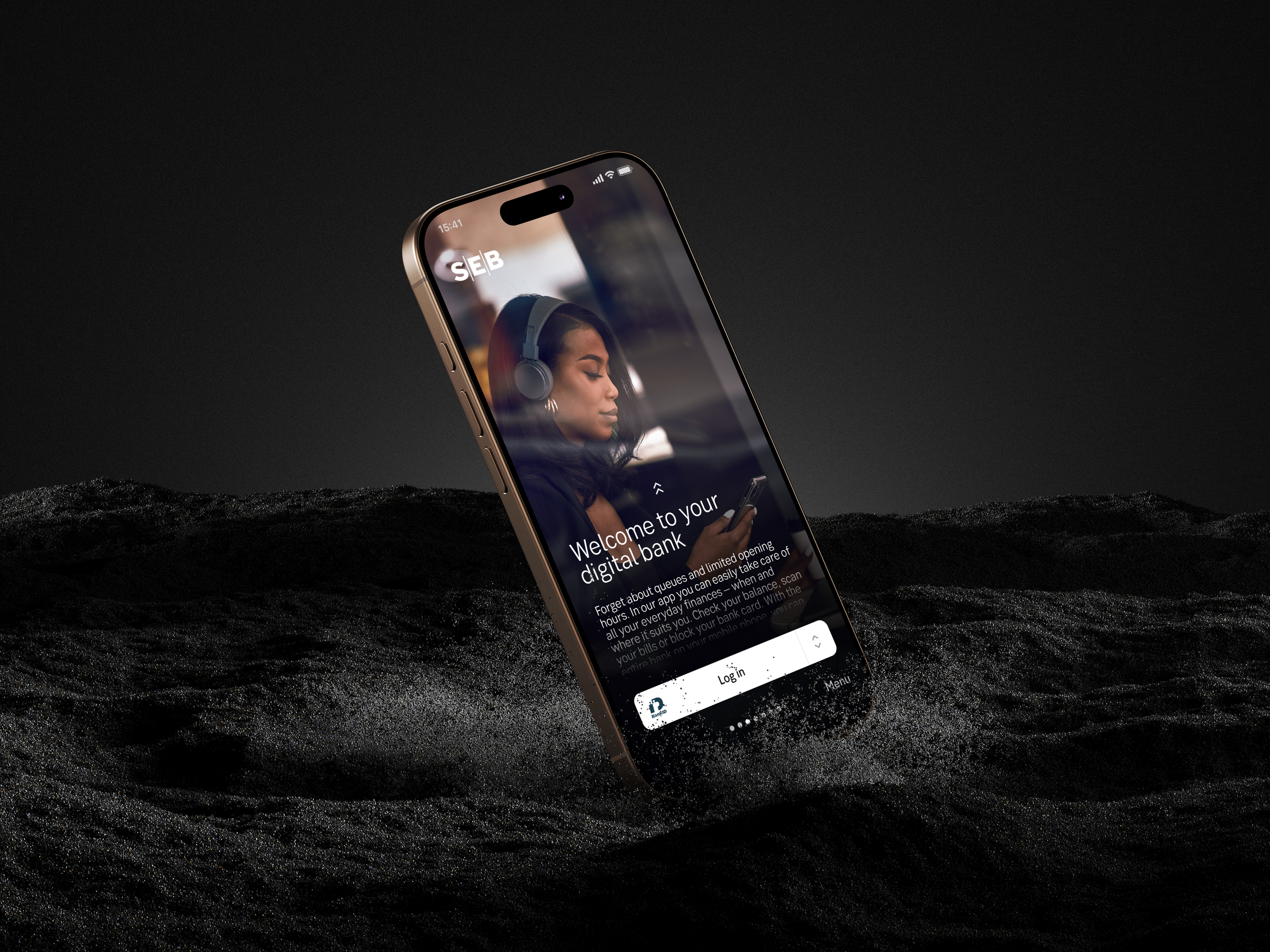
SEB Mobile app experiences
The home of everyday finance
CX lead – SEB mobile apps
I lead the customer experience across SEB’s mobile apps for private, corporate, and youth customers, shaping the strategy, design, and long-term vision for our digital channels. My work includes creating design guidelines, contributing to our design system, and coaching designers across the organization.
I collaborate closely with product, technology, and business teams to ensure solutions are user-centered and deliver lasting value. Recent highlights include leading our accessibility compliance efforts under the European Accessibility Act.
Inclusive design and accessibility
Accessibility has been a core part of my UX work, all throughout research, design, and collaboration with developers. I focus on creating inclusive solutions that work for a wide range of users, rather than treating accessibility as a final compliance check.
Mini case: Accessibility guidelines
The challenge
The team lacked shared accessibility guidelines, which resulted in inconsistent solutions and experiences and accessibility issues being discovered late in the process. Since WCAG is mainly describing guidelines for web there was a need to translate and understand the different requirements in a native mobile app context.
My role
I took the initiative to define practical, design- and developer focused accessibility guidelines adapted to both the product, platform and the existing design system.
Studied the WCAG requirements and translated them into an app context
Created clear “do & don’t” examples for designers and developers and documented guidelines based on our own design system.
Collaborated on the guidelines with developers to ensure technical feasibility and with visual designers to align on design decisions.
Held internal learning sessions to spread the knowledge and lift the competence within the organisation.
Audited the interface together with product, dev, QA and design to identify our current accessibility issues.
Started solving bugs together in our teams.
Process
Three short examples of guidelines created in the design system
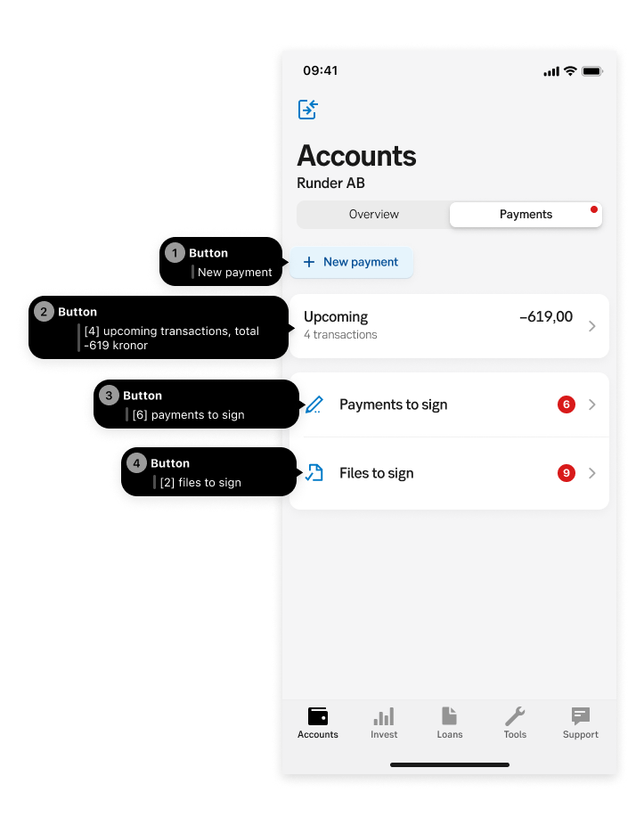
Meaningful sequence
Guidelines on designing meaningful reading order for screen reader users, clarifying what creates a logical, understandable sequence and what breaks it. Includes guidance on using custom actions and documenting expected screen reader behavior in the different platforms directly in Figma to ensure shared understanding across design and development.
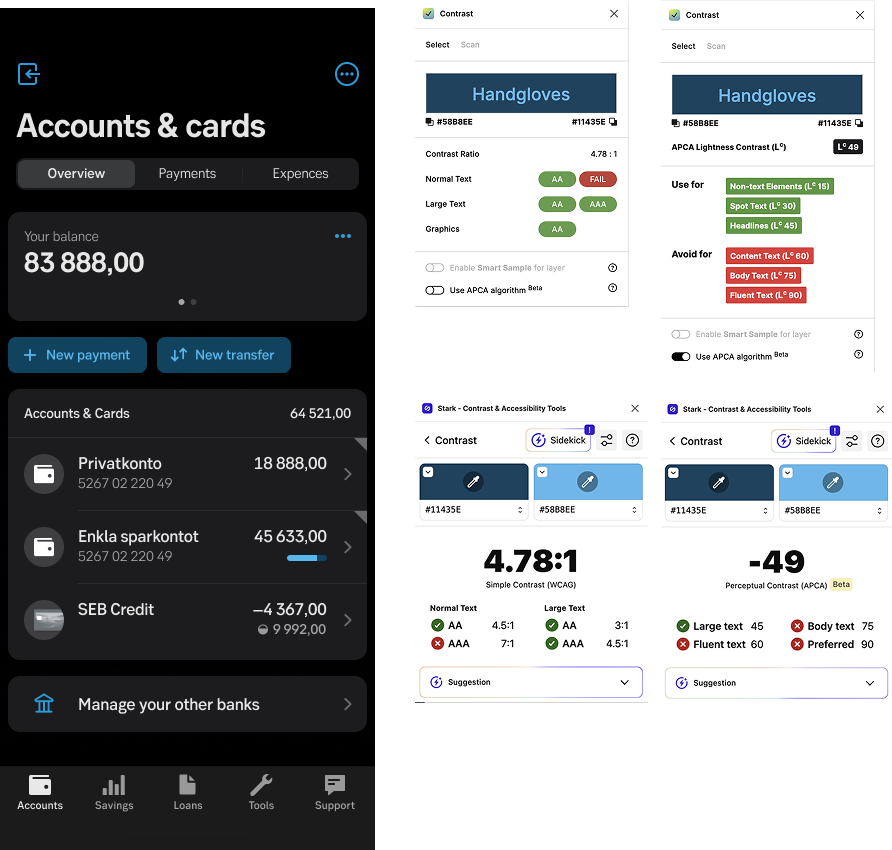
Color contrasts
I created color contrast guidelines to ensure text and interactive elements are readable for users with low vision, color vision deficiencies, or when using screens in challenging conditions. The guidelines explain how to measure contrast ratios using accessibility tools and how to apply them consistently across the design system. By addressing color contrast early in the design process, accessibility issues are reduced and visual clarity is improved for all users.
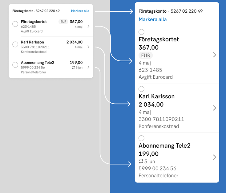
Guidelines ensuring layouts and components support text scaling without loss of content, functionality, or readability. Includes recommendations for spacing, accessibility layouts, differences in Android and iOS., and handling text overflow at increased text sizes.